Building Trust Through Design: Caze Agency’s Identity
When we set out to design the brand identity for Caze Agency, the goal was to translate their philosophy into a visual and verbal language that feels as authentic as the way they work.
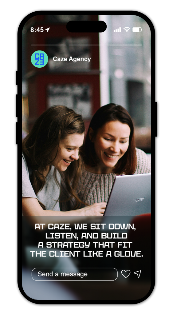
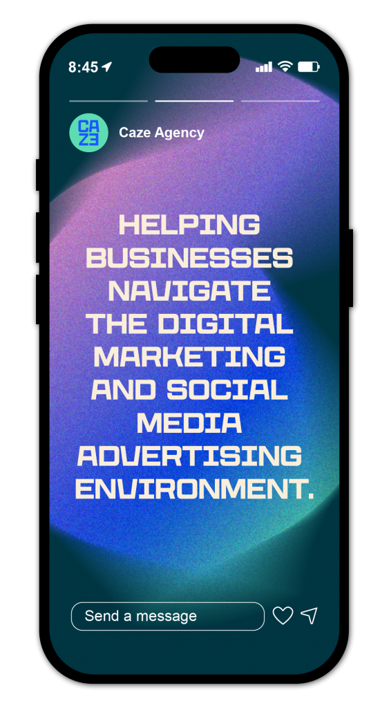
Caze is not your typical digital agency. Their promise is built on Adaptive Craft, Radical Transparency, and Human-First Excellence, values that push against the clichés of the industry and redefine what digital collaboration can look like.
Brand Identity Motion Design
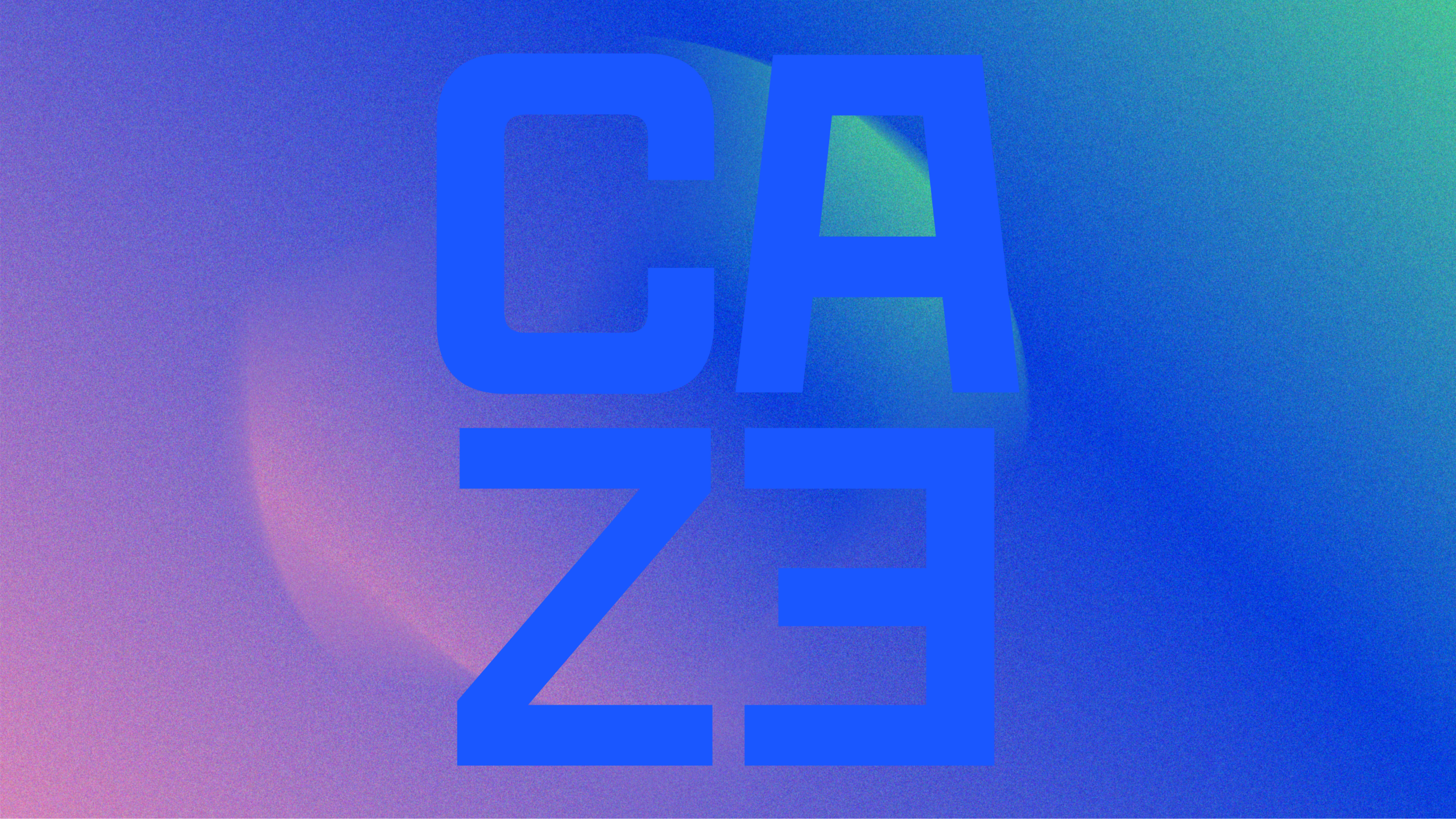
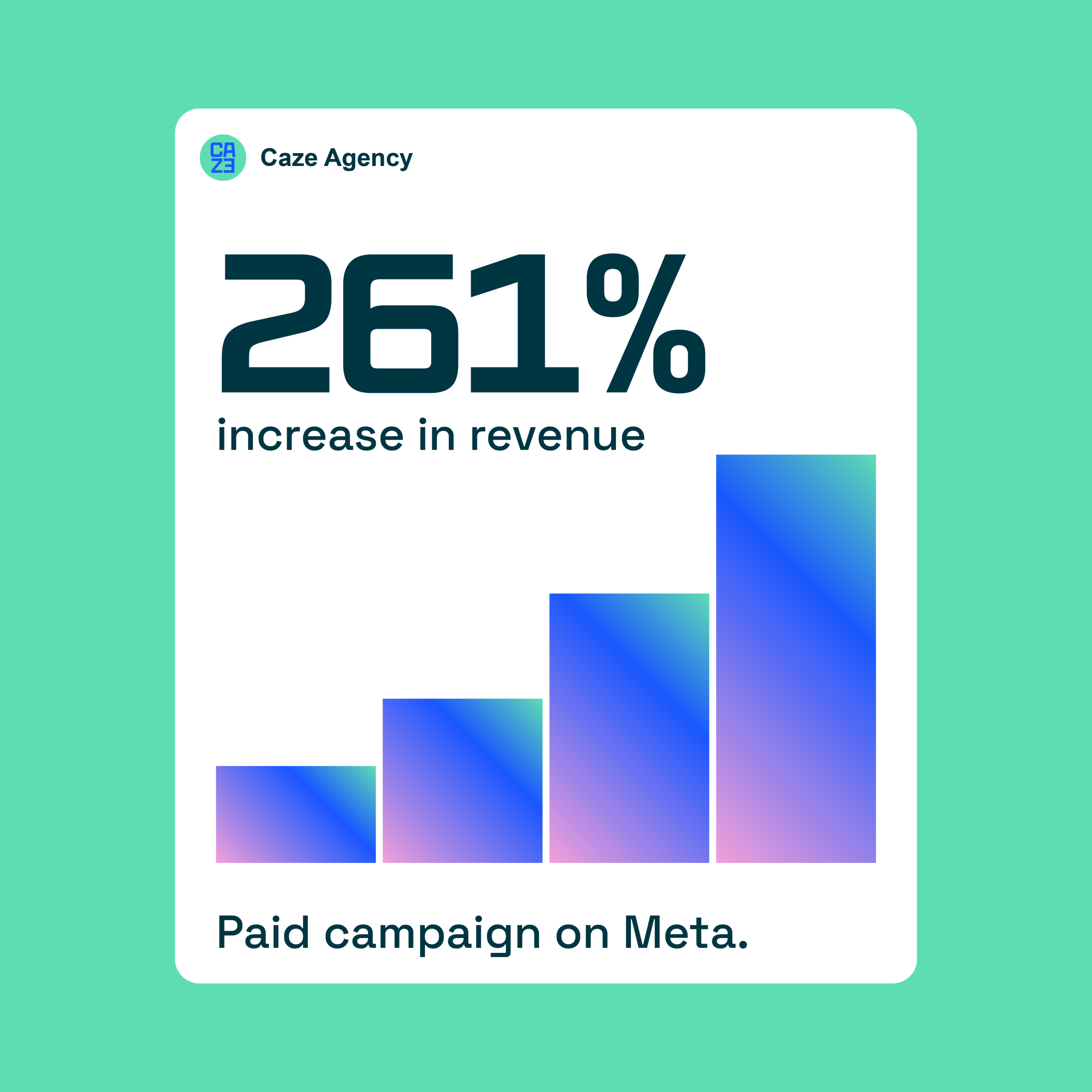
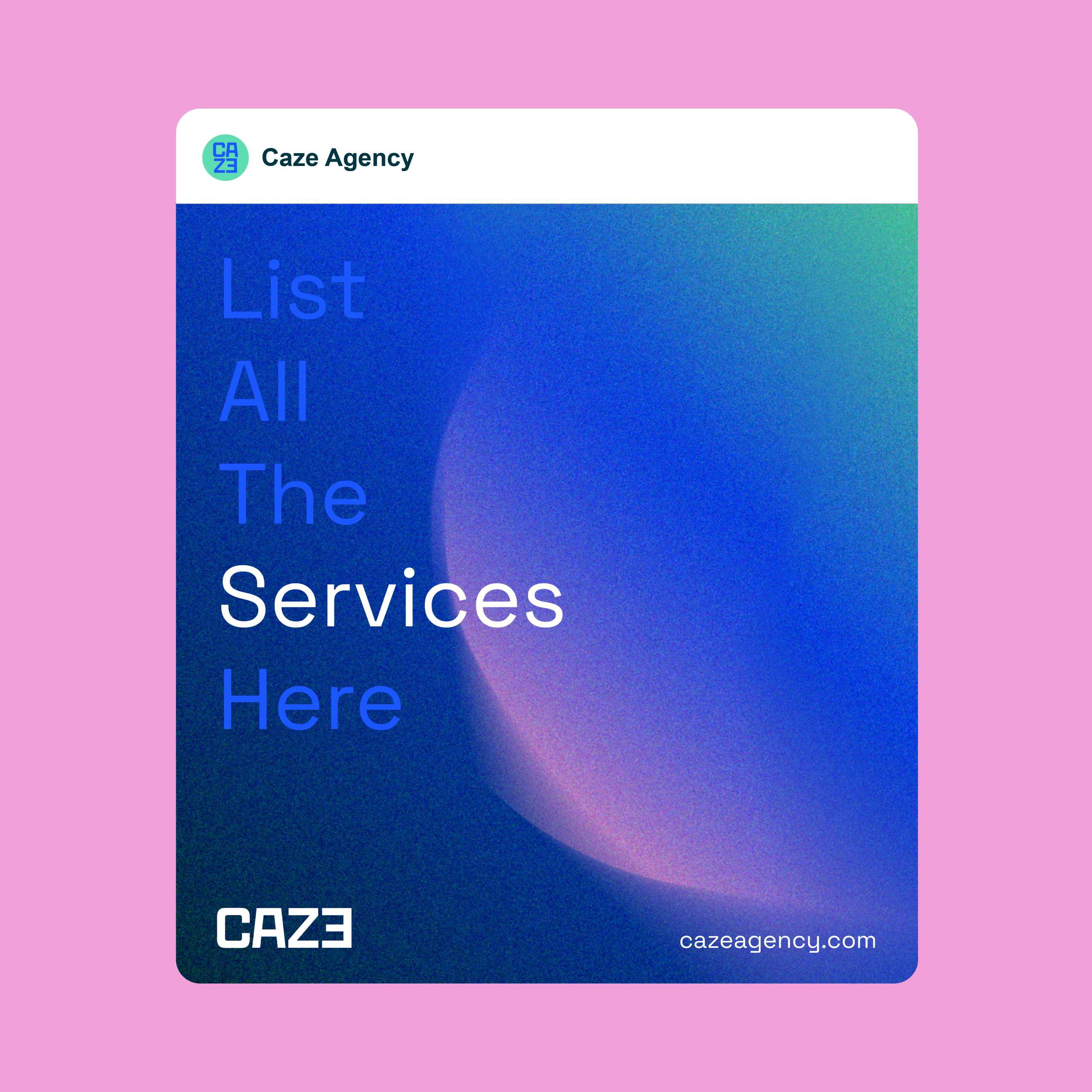
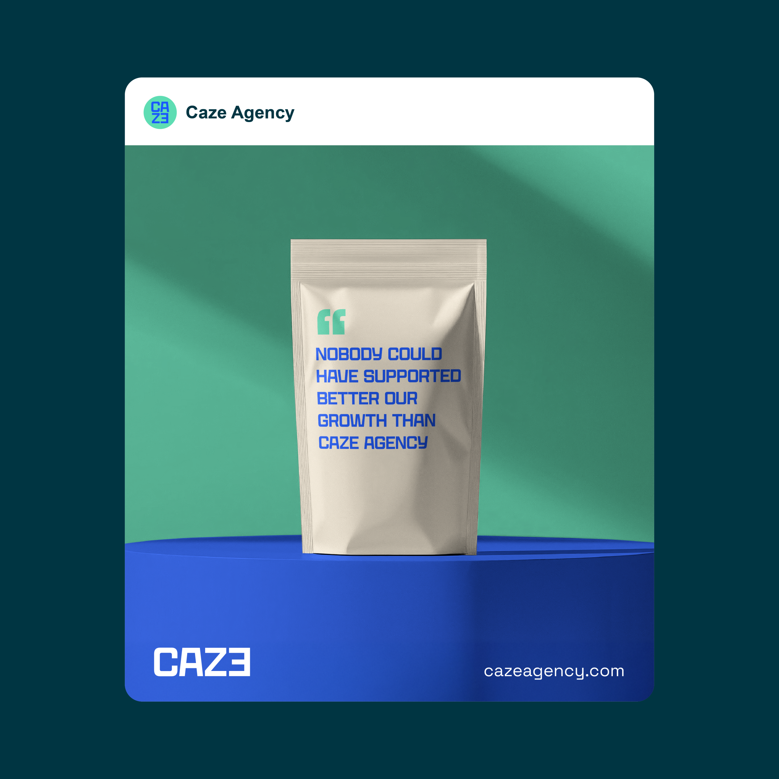
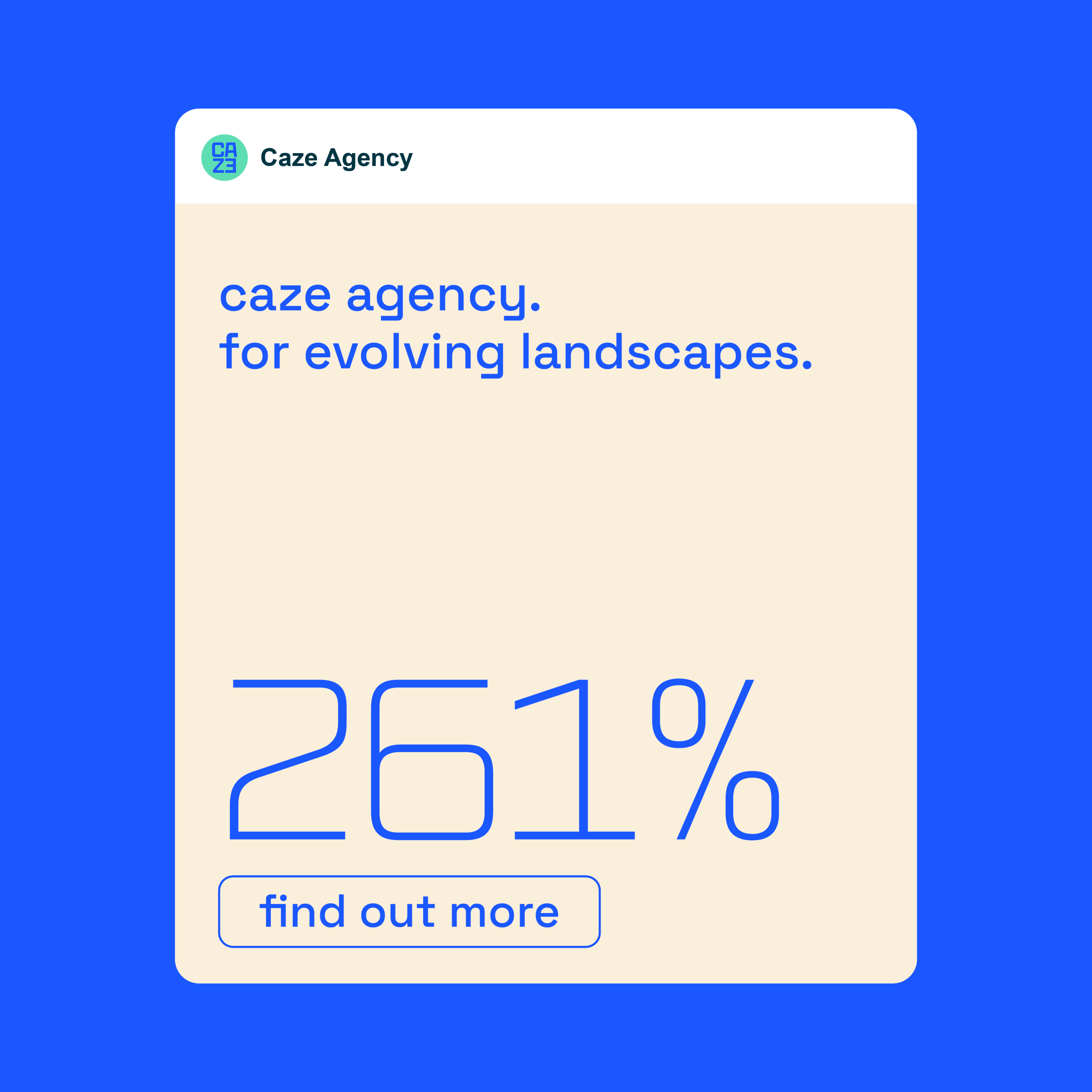
To bring Caze’s vision to life, we developed a complete identity system: a sharp and adaptable logo, a contemporary color palette, carefully chosen typography, and a bold tone of voice that speaks directly, without smoke and mirrors.
The result is a cohesive ecosystem that gives Caze a confident and consistent presence across all platforms — from client pitches to digital campaigns. Motion design was also a key component, adding dynamism and adaptability to their brand language.
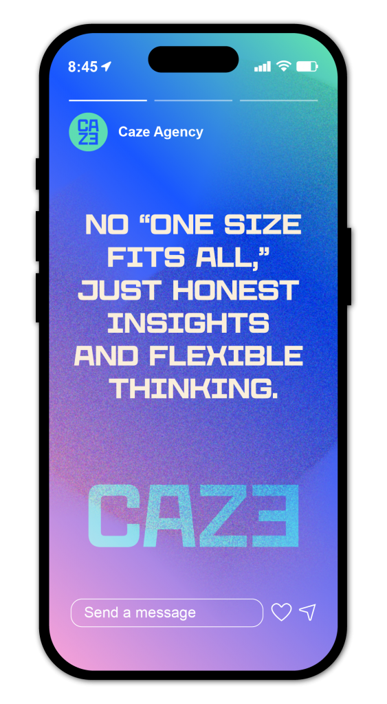
What makes Caze Agency stand out is their refusal to hide behind jargon or inflated promises. Their brand identity mirrors this approach: straightforward, transparent, and empowering. It is an identity that not only communicates who they are today but also scales with their growth, offering a foundation for lasting trust with their clients.

